When Every Design Passes
Six artificial intelligence (AI) visitors, each playing a different member of this school, tried 30 ordinary tasks on this site. They succeeded at all 30.
That is the result that told me the navigation needed rebuilding. Not because anything failed, but because a perfect score was hiding the cost: a median of four steps per task, fourteen of the thirty taking five or more, and one navigation tab holding 26 of the site's 64 menu entries under a label all six visitors independently found unclear.
This is how the site you are reading was redesigned over four days in late September 2026: what was measured, how several AI designers were set against each other, where an independent second model changed the outcome, where I overruled both of them, and how the scenery in the page headers was drawn, then redrawn for every time of day. The system underneath (the news pipeline, the checks, and how they fail) is the subject of When a Check Stops Checking. This piece is about the surface.
The Visitors
I do not write code, and I did not want to judge the navigation by how it felt to me, because I know where everything is. So the first pass used AI agents as stand-ins for people who do not: a first-semester student on a phone, a third-year student on rotation, a skeptical physiology lecturer, a faculty researcher, a course director and an administrator in the dean's office. Each worked through five tasks on a private copy of the site, reading only what a visitor would see.
All 30 tasks succeeded. The friction was in how: the median task took four steps, and eight needed the search box. Six more agents read every hand-written page for length and estimated that about 18 percent of the visible words could go. The records show individual cuts made since, but not whether the whole 18 percent was ever applied.
Every Design Passed
The second pass asked three AI designers for three different navigation structures, and asked the second model for one of its own. The second model is OpenAI's gpt-6-astra, which I call Astra: a different company's model, run from the command line, with no knowledge of the site beyond what it is shown. Its value is not that it is smarter. It fails differently, so agreement between the two models is evidence and disagreement is a finding.
Fifteen fresh visitor agents, three per design, then tried 42 tasks on text versions of each structure, with the search box removed so that the structure alone was tested. Thirty of the tasks were ones the designers had seen. Twelve were held back, and no designer saw them.
| Design | Tasks completed | Clicks, tasks the designers saw | Clicks, held-back tasks |
|---|---|---|---|
| Seven Jobs (organized by task) | 42 of 42 | 1.37 | 3.08 |
| Rename and Re-route (conservative) | 42 of 42 | 1.80 | 2.58 |
| Your Section First (by audience) | 42 of 42 | 2.00 | 3.08 |
| Astra's own design | 42 of 42 | 2.07 | 2.42 |
| The site as it was | 39 of 42 | 2.47 | 2.67 |
Every redesign scored perfectly, which made the success rate useless for choosing between them. The information was in the clicks, and in one pattern especially. The design organized around tasks was the fastest by far on the tasks its designer had seen and among the slowest on the ones it had not. Its home page had, in effect, memorized the test: it repeated about ten of the test questions almost word for word.
The conservative design was chosen, with seven ideas grafted on from the others. Astra's design had the best score on the held-back tasks, but it would have retired six pages and broken their addresses, and it kept the tab label every first-round visitor had stumbled on. Astra also corrected the recommendation it was reviewing, which had called the conservative design the only one faster than the old site on held-back tasks. Its own design was faster too, and it pointed out that a difference of 0.09 clicks is too slight to support much confidence. It was right on both counts.
Reviewers That Could Not See the Page
Halfway through building the new navigation, I asked why none of these passes had looked at the physical layout: where the buttons sit, how big they are, how links are presented. The answer was uncomfortable. Every reviewer had read the pages as extracted text, so none of them could have seen a layout problem.
The fix was to review from screenshots and measurements at phone, tablet and desktop widths. A layout audit through six separate lenses produced 94 findings and 22 changes, which eight agents then built in parallel on a private copy of the site. The prompt library's student view went from 16.1 screens of scrolling on a phone to 5.6. The home page went from 6.7 to 4.5.
Removing the Sidebars
My own motivation for the whole exercise, which I only put into words partway through, was to get rid of the menu column down the left of most pages and the contents column down the right. The goal was a site organized well enough not to need either.
Four complete sidebar-free versions of the site were built, each in its own isolated copy: tabs with a dock, a floating navigator, inline wayfinding, and one built to a specification Astra wrote. Each was crawled in a real browser and walked by fresh visitor agents on 20 new held-back tasks. All four completed all 20, at 1.2 to 1.4 clicks each. The visitors had hit the ceiling again.
So the decision moved to the cost on the screen. A small script measured where the text began on nine sample pages of each prototype, and only the floating navigator left it where it was, at both of the widths tested. Astra ranked it first, and ranked the design built to its own specification third, criticizing its own spec for giving navigation too much weight.
Both models then recommended a restrained palette for the new design, and here I disagreed with both. If color can do what other signals cannot, it is worth using, provided it is consistent. The result is color by meaning: each color stands for one kind of page everywhere on the site (tools, prompts, guides, lessons and so on), with a small color key wherever colors appear. Retested on 20 more new tasks, the finished design completed all of them at 1.25 clicks.
Three Designers at Once
The next afternoon, looking at the new navigation on a large monitor, I asked why reading pages were so narrow. At 1920 pixels across, the screen was mostly empty gray. The measurement agreed: across the site's 69 reading pages, an average of 51 percent of each desktop screen sat in large empty areas, and 54 percent on a smaller laptop screen.
I was nearly out of my weekly allowance, but I had an unused $250 credit for Claude sessions that run on Anthropic's servers rather than my laptop. So three designers ran at the same time, in the cloud, each given one direction: sections side by side, a reading column with a companion column, or a different arrangement for each kind of page. They all started from the same kit: one brief with thirteen hard rules, one measuring script, and a recorded baseline.
Two practical problems complicated the setup. The cloud sessions could not publish their work until I asked each one to add the repository to its own sources, and their browsers could not load the site's typeface, which silently inflated one of the measurements by six to thirty characters a line. That is why no cloud number was trusted until it reproduced the recorded baseline, and why every design was finally measured again on my own machine, with one script.
| Designer's direction | Blank at 1920 | Blank at 1440 |
|---|---|---|
| The site as it was | 51% | 54% |
| A: sections side by side | 18% | 17% |
| B: a companion column | 37% | 43% |
| C: an arrangement for each kind of page | 15% | 15% |
Astra reviewed screenshots of all three and ranked them C, A, B, saying that C "looks composed, rather than merely widened." It also found the most serious defect in the design with the best number: C had separated a policy heading from the provisions it introduced, and the blank-space measure had rewarded it for doing so. Astra's warning was that a density score can reward worse reading, which is exactly why it was not the only judge.
I chose C with Astra's six fixes, and then overruled two of them. The fixes had removed the thin outlines around sections for a calmer look. Putting them back kept the blank-space score at 15 percent instead of 37, because the script counts an outlined panel as used, which is a judgment about the measure rather than a saving of space; I kept them because I preferred the structure they give a page. They had also moved the navigation into a slim bar at the top of the page; I wanted it back in the bottom-left corner, where a first-time visitor can see it, folding after a few seconds into a small compass labeled "Navigate". Reading pages went live at 19 percent blank at 1920 and 18 percent at 1440.
Designer C's cloud session then ran six follow-on rounds (whole-card links, a site-wide title-case pass, the news pages, the remaining empty space, the weekly page, and a final handoff), each from a written brief, each reporting back in a status file, each checked on my laptop and merged only when I said yes. Its last job, sent when the credit stood at $54, was to write down everything it had learned as a design reference and a checking script, so that the work could continue on the laptop. The records I have do not show how much of the remaining $54 that job used.
Scenery Drawn in Code
The pictures in the page headers are not photographs or generated images. Each is drawn in code when a page loads, on screens wide enough to show it.
The night sky is real. The stars are the whole Yale Bright Star Catalogue at their true positions over Antigua for a particular evening, 3,542 of them above the horizon at night, with 9,033 fainter ones from the European Space Agency's Hipparcos catalog and the true path of the Milky Way. The Moon, Venus and Jupiter appear only when they are actually up over Antigua, the Moon in its real phase for the visitor's date, and the islands on the horizon of the home page are traced from satellite elevation data at their true bearings. Where the art takes a liberty, the code says so: the islands are drawn 2.6 times their true height, the Moon several times its true size and set where each picture composes it (over Shirley Heights, moved down into a sky too short to hold it), and a thin fill of painted stars is labeled as the one part of the sky that is not real.
Each page's picture is one subject, drawn from photographs, several of them my own. Shirley Heights, the view over English Harbour on the For Students page, went through three versions in about 45 minutes. The first was close but off, and it is a view people recognize worldwide, so it had to be identifiable at a glance. The second traced the landforms from a photograph, recording each point as a fraction of the picture's width. The third used my own photographs, turned the sky to the true bearing of the view so that the May sunset sits behind the far range as it does from the lookout, and left out the cacti, which do not read as cacti once stylized.
The corrections came from looking. The first piece, a lecture hall, appeared to hang over the water. The grain added to make the pictures look printed read as noise on the land. When I said the home page's sky looked sparse, the stars per million pixels were measured instead of guessed (1,030 on the home page against about 9,500 in the smaller pictures), which pointed to scale rather than the star catalog as the cause. And when five placements were drawn one night while I slept, I approved two and declined three, because a picture should be about the page it sits on. The declined drawings were kept, and one of them, St John's Harbour, is now on the About page.
The method that reached a standard I was happy with is written down in the site's design reference, along with a script that renders a piece at two screen sizes and in each of its five versions, beside the page it belongs to and the photographs it was drawn from. The rule it encodes is simple: nobody sees a first draft.
The Same Place at Five Times of Day
After the redesign went live, a colleague who prefers light mode asked on a call why the site looks so dark. The answer was the toggle, but the question stayed with me: every picture was drawn at dusk or at night, so even a light page opened onto a dark window.
So every picture now comes in five versions, Dawn, Day, Sunset, Dusk and Night, and the visitor's own clock chooses among them: Dawn from 5 in the morning, Day from 9, Sunset from 5 in the afternoon, Dusk from 7 and Night from 9. The light and dark toggle now changes only the page, not the picture. A page left open follows the clock too, crossfading to the next version when the hour turns.
The clock on the American University of Antigua's tower keeps Antigua's time, Atlantic Standard Time, wherever you are reading from, while the sky follows your own clock. For a reader in Antigua the two agree; for anyone elsewhere, the tower shows what time it is on campus.
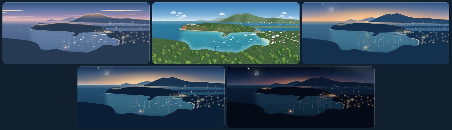
Each picture is drawn once, and the light is what changes. A version is a set of colors for the sky, sea, land, stone and roofs, shared by every picture, plus a few rules: the lights are on except by day, stars and grain belong to dusk and night, and the Moon appears only from sunset on, in its real phase and only when it is really up. Daylight, though, shows what the dark had hidden, so Day needed new drawing. Shirley Heights was the test piece, drawn from my own photographs of the view: the house compound on its knob above the bluff, Nelson's Dockyard on its land bridge with its dock and moored yachts, and Galleon Beach with its sand, its pier and the palms behind it. Buildings are drawn in every version, so a lit window at night is a house by day.
The Sun follows the same rule as the stars. It appears only where it truly is, taken from the same ephemeris (the table of true positions) for the same date. At dawn it rises behind every view but one. By day it is high overhead, out of every picture, so Day has none. At sunset it is in view in most pictures, but a single moment would hide it behind land in some and leave it floating in open sky in others. So each picture takes its own true minute of the sunset hour, chosen from a sheet showing it at eight minutes between 5:40 and 6:31 in the evening. In the view drawn for the Learn page it rests on the summit of the far hills; on News & Events it touches the sea between the yachts. Where land stands in front of the Sun, it lays no path of light on the water, because what hides it from the viewer hides it from the water in front too.
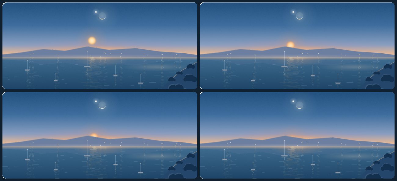
The finish came from somewhere else. My other project, the media tracker behind My Favorite Game Was Not a Game, draws its own night scenes with a small toolkit, and those scenes set the standard. Some of its code was ported nearly line for line: ripples on the water, dense at the horizon and long near the viewer; broken columns of light under lamps and the Sun; the print grain; and a seeded random sequence, so that a picture draws the same way every time. Other techniques came over as ideas: mirrored reflections, halos and pools of lamplight, mist, motion limited to what a browser can animate smoothly (and switched off for anyone who asks their device for less motion), and one shared world with a single subject on each page. Some things stayed behind. The tracker's indigo palette is lovely, but I kept the navy and teal here because they sit closer to the school's own colors. Its grain covers everything; here it stays on the sky and water, because on the land it read as noise. Its scenes move continuously, while these play one gentle pass and then hold still. And the tracker draws no daylight at all. The influence ran both ways: the tracker's own island scene began as a port of this site's first art study.
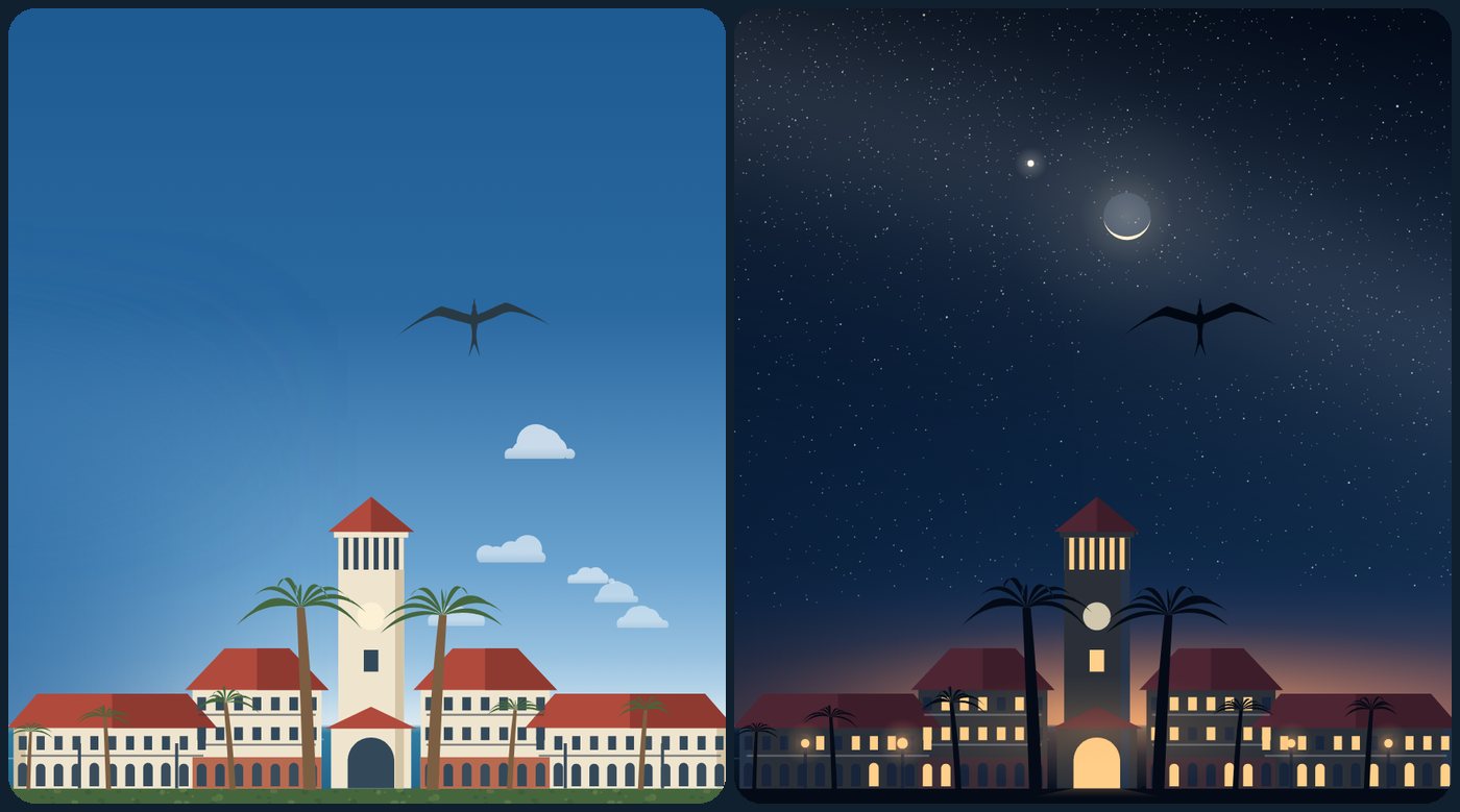
The tools were the ones used for the layout. A headless browser rendered every version of every picture at several screen widths in both color schemes. The white headline on the home page was measured against the picture behind it, with the words hidden, and kept a contrast of at least 4.5 to 1 in every version. A test with a faked clock carried each page across all five boundaries to check that the pictures turned. Before the work was merged, two reviewer agents read the changes without editing anything and found eight small defects, among them lanterns that lost their glass by day and boats that kept their navigation lights on.
The rest came from looking again. Across that day I caught a tree standing in the water, black lines drawn through the beach, a reflection under a Sun already set behind the land, a wisp of haze that read as a stray cloud, green palm trunks, a green iron fence, and the school hanging off the edge of its lawn. The first Sun was also a crisp, bright disc that sat oddly against the softly shaded land, and a different size in every picture. It is now soft, deeper and redder near the horizon, and the same size everywhere.
Captions, a Library and Tonight's Sky
The next day I looked at the pictures in place and asked for smaller things. Every picture now starts level with its page's title, or with the breadcrumb on a deeper page, where the breadcrumb is the top line. A picture of a real place also has a caption: what it shows, then the time of day it is drawn at, which links to this section and says "About the pictures" when you hover over it. The picture gives up exactly the height of its caption, so nothing else on the page moves. A caption is a claim in a way a drawing is not, so two AI agents checked each one against published sources, the second trying to prove the first wrong. They caught three errors in my drafts: Shirley Heights looks northwest over the two harbors, not west; Montserrat lies southwest of Curtain Bluff, not west; and the old courthouse is dated 1747 by some sources and 1750 by others, so its caption gives no date. A picture of no particular place, like the guides' lamp-lit steps, has no caption at all, since one would only describe what is already evident.
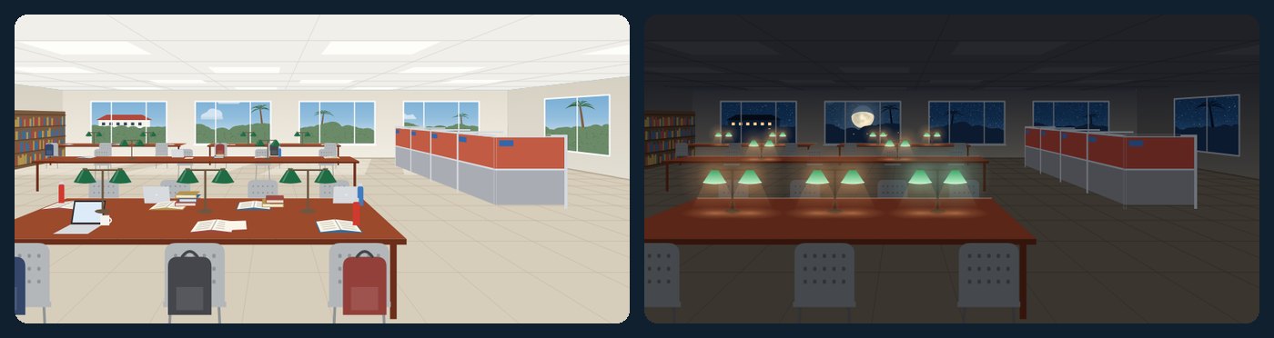
The Learn page's picture became the American University of Antigua's own library, drawn from the school's photographs of its study hall with the people left out: the double green banker's lamps on long cherry tables, gray chairs and the red study carrels. It is the only interior, so its windows carry the time of day and its lamps are the lights. What is on the tables follows the clock too: textbooks, laptops and backpacks by day, a few early arrivals at dawn, fewer as the sun sets, only the library's own stacked books at dusk, and at night nothing but the lamps. When the page grows taller to show where a reader left off, the picture shows more of the same hall rather than a bigger room.
The last thing that was not true was the sky. Every night picture showed the same crescent Moon from that one evening in May, and one shape repeated across eight pages starts to look like a symbol. The Moon now shows its real phase for the visitor's date and appears only when it is actually up over Antigua at that hour, so on a moonless night there is none; Venus and Jupiter follow the same rule. Each still sits where its picture places it, with the Moon's lit side toward that picture's sunset, and the Moon now shows its darker seas, faintly. The positions come from published astronomical formulas, the same ones used for the rest of the sky, and are worked out in the visitor's browser, with nothing to download or update. Before trusting that code, I had it checked against the separate program that computed the rest of the sky, at 400 moments over four years: the two agreed to within a hundredth of a degree, and every time on whether each body was in the sky. Sunset was also made redder and dawn more purple, so the two are not mistaken for each other; dusk became darker, closer to the real sky at that hour, with only a faint glow left on the horizon; and night has no glow at all.
What It Cost
Between September 24 and the morning of September 28, the repository recorded 152 commits: 135 under my name, starting on the evening of the 25th (26 of them merging parallel work back together), and 17 automated news refreshes. On the site's main line, 166 files changed; leaving out the files the news pipeline generates, 152 files, with about 29,700 lines added and 1,900 removed.
The first navigation pass used 13 agents and the second 23 (about 3.9 million tokens); the layout audit used nine. The builds and prototypes that followed used more, but I do not have an exact total. The cloud credit went from $250 to $54 by the final handoff. Astra's reviews came out of my separate ChatGPT allowance, at about 22,000 tokens for its design and review in the second pass.
The five times of day came later, on September 28: 20 commits over about seven and a half hours, adding 802 lines and removing 100 across seven files.
The captions, the library and tonight's sky followed on September 29: ten commits over about five and a half hours, adding about 940 lines and removing about 75 across 13 files.
My own time was evenings and a very long weekend. I did not measure it.
What Transfers
- When every design scores 100 percent, the success rate can no longer tell them apart. The information is in the clicks, the backtracks and the screen space.
- Hold back tasks the designers never see, and use fresh ones for every retest. A design that has seen the test can simply learn it.
- A reviewer that reads a page as text cannot see the page. Review layouts from screenshots at several widths.
- Parallel designers need one kit: a shared brief with hard rules, one measuring script, a recorded baseline, and one machine that measures every candidate.
- Any single number can be gamed, so pair it with a reviewer from a different model family, and write down why you overruled both of them when you do.
- For a real place, trace it from a photograph. Memory draws a generic hill.
- Draw a scene once and make the light the variable. Five times of day cost a set of colors each, not five drawings.
- Where accuracy matters, choose among true moments rather than inventing one. The Sun sits where the ephemeris puts it, at the minute that composes best.
- Test anything that depends on the time of day with a faked clock, and measure contrast on the rendered picture, not on the colors you meant to use.
- A caption is a claim. Check each one against a published source, with a second reader trying to prove the first wrong.
- If a picture shows a real sky, compute it for the reader's date rather than freezing one evening, and test the calculation against an independent one before trusting it.
What This Does Not Show
Every visitor in these tests was an AI agent, not a person. A test with about eight students and faculty on their own phones was planned, and a kit for it was prepared, but I do not have the time to run one, so nothing here shows that real people find things faster.
Blank space is a proxy for a screen that is not wasted, not for understanding, and Astra's warning about it stands. Beyond an anonymous visit count, the site has no way to measure whether the redesign changed how it is used. The stars are also one evening in May: the pictures follow the hour of the visitor's day and the real Moon and planets, but not the season, so the stars stay as they were that evening. And the art, however carefully sourced its stars, is a matter of taste: mine.
Content last reviewed September 29, 2026. Review dates are maintained as described on the About page.